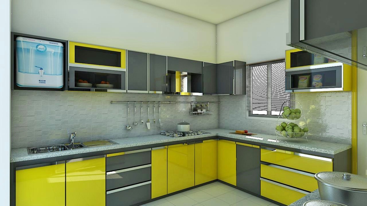
When we were choosing cabinets for our renovation, we picked “white” in three separate showrooms. Kitchen cabinets from one place, wardrobe from another, bathroom vanity from a third. All three suppliers showed us white samples. All three looked fine in their respective showrooms.
When everything was installed, the kitchen cabinets were a clean cool white, the wardrobe had a warm creamy tint, and the bathroom vanity leaned slightly grey. Standing in the hallway where all three spaces were visible, the difference was obvious. Not dramatic — but exactly the kind of thing that makes a home feel slightly unfinished without you being able to explain why.
Nobody had warned us this would happen. And once the cabinets were installed, there wasn’t much we could do about it.
Here’s what was actually going on, and how to avoid making the same mistake.
”White” Is Not a Color. It’s a Category.
This is the core problem. When a cabinet supplier shows you a “white” door panel, they’re showing you one specific white out of what could be hundreds. Paint manufacturers typically offer dozens of white shades in their standard range alone, and cabinet manufacturers use their own proprietary finishes that don’t map neatly onto any paint brand’s chart.
The reason all these whites look different comes down to two things: undertone and light reflectance.
Undertone is the secondary color hiding inside the main color. Every white has one. A white with a pink undertone looks slightly warm and flushed. A white with a blue or grey undertone looks crisp and cool. A white with a yellow undertone looks creamy. A white with a green undertone can look almost sage in certain lights. You often can’t see the undertone when you look at the sample in isolation — it only becomes visible when you compare two different whites side by side, or when the white is installed against other surfaces in your home.
Light reflectance is how much light the surface bounces back. A high-gloss white reflects almost everything and reads as very bright and sharp. A matte white absorbs more light and reads as softer and slightly darker. The same white color in gloss versus matte can look like two different shades in the same room.
When you buy cabinets from three different suppliers, you’re almost certainly getting three different undertones and potentially three different gloss levels — even if all three suppliers called their product “white.”
Why Showrooms Make This Problem Invisible
Cabinet showrooms are designed to make individual products look their best. The lighting is usually warm, even, and flattering. The display environments are controlled. You’re evaluating each cabinet in its own context, next to surfaces the showroom has chosen specifically to complement it.
What you’re not doing is seeing the kitchen cabinet next to the wardrobe next to the bathroom vanity, all at once, in your home’s specific light.
Your home has its own light signature. A north-facing kitchen gets cool, indirect daylight. A south-facing bedroom gets warm afternoon sun. A windowless bathroom runs entirely on artificial light. The same white cabinet will look noticeably different in each of these environments — cooler in the north-facing room, warmer in the south-facing one, and whatever color your bathroom bulbs are in the bathroom.
This is why a white that looked perfect in the showroom can look wrong in your home, and why three whites that each looked fine in three different showrooms can look like three different colors when they’re all in your house at the same time.
The Three-White Problem in Practice
Let me be specific about what goes wrong and where.
Kitchen cabinets are usually specified first, because the kitchen is the most complex room and typically requires the most planning. Kitchen showrooms tend to use bright, cool lighting to make food preparation surfaces look clean and clinical. Cool-white cabinets look excellent under this lighting and in the showroom context.
Wardrobes are often specified separately, sometimes from a dedicated wardrobe supplier or a furniture brand. Wardrobe showrooms often use warmer, more residential lighting because they’re selling a bedroom feel. The warm lighting makes creamy or slightly warm whites look inviting rather than yellowed. A white wardrobe that looks perfect under warm bedroom lighting may read as noticeably cream when placed next to the cool white kitchen cabinets visible from the hallway.
Bathroom vanities are often the last cabinet purchase, specified once the main rooms are done. Bathroom cabinet suppliers sometimes use different base materials than kitchen or wardrobe suppliers — bathroom cabinets frequently require moisture-resistant board, which can take paint or finish differently than the kitchen cabinet substrate. The same paint code applied to a different base material will not produce exactly the same visual result.
None of these individual decisions is wrong. The problem is that they were made independently, in different environments, against different reference points, at different times. The result is three whites in one home that don’t agree with each other.
How to Spot the Undertone Before You Buy
The good news is that undertones are visible if you know how to look for them. Here’s how to check:
Compare samples against a true neutral. A piece of plain white printer paper is close to a neutral white with minimal undertone. Hold your cabinet sample next to it. If your sample looks warm (cream, yellow, pink) next to the printer paper, it has a warm undertone. If it looks cool (blue, grey) next to the printer paper, it has a cool undertone. This is much easier to see against the neutral reference than when looking at the sample alone.
Check in natural daylight, not showroom lighting. Take the sample outside or hold it near a window. Natural daylight is more revealing than any artificial light. A white that looks clean under showroom LEDs may look obviously warm or cool in daylight.
Look at the sample against your existing surfaces. If you already have flooring, wall tiles, or countertops in place, hold the cabinet sample against them. What undertone does your floor have? If your floor is warm-toned (wood with yellow or orange in it), a cool-white cabinet will fight against it. If your floor is grey or stone, a warm-white cabinet will look off.
Ask specifically about the undertone, not just the color name. Most cabinet suppliers can tell you whether a finish leans warm or cool. If they can’t, that’s useful information — it probably means their quality control isn’t precise enough to guarantee consistency.
What Happens When You Get It Wrong
A white-on-white mismatch is the most common cabinet color problem, but it’s not the only one. The same issue happens with any color that appears in multiple rooms.
Grey is the second most common problem. A cool blue-grey kitchen cabinet against a warm taupe-grey bedroom wardrobe visible from the same corridor reads as two different colors, even though both are “grey.” The warmer grey can look brown or beige next to the cooler one.
Wood-look finishes have the same problem at a more extreme level. Light oak and pale walnut are both “light wood,” but one reads golden and warm while the other reads cool and grey-brown. Two different wood-look finishes in the same sightline look mismatched in a way that reads as cheap rather than intentional.
White shows the problem most clearly because it’s the most common cabinet color and because most people have a mental model of “white is white” that doesn’t prepare them for the variation.
The Practical Fix: Same Source, Same Batch
The most reliable way to ensure cabinet color consistency across your whole home is to have all cabinets — kitchen, wardrobe, bathroom, study, entrance — specified by the same supplier from the same production batch.
When one supplier handles all the cabinetry, several problems disappear automatically:
One finish system. The supplier uses one paint or laminate line across every cabinet. Kitchen cabinets and wardrobe doors come from the same material stock with the same application process. The white is the same white.
One quality control process. Color consistency within a single production run is something suppliers control. Color consistency across three separate suppliers is something nobody controls — each supplier is responsible only for their own product meeting their own standard.
One sample reference. When you’re approving finishes, you approve once against one set of samples rather than approving separately for each room and hoping everything aligns. If you want to check that the kitchen white and the wardrobe white will match, you can literally look at them together, because they come from the same supplier.
Batch coordination. Even within a single supplier, cabinets made in different production batches can have slight color variation. A good supplier will schedule your order so that all white surfaces across all rooms are produced in the same batch. This is something you can ask about explicitly before placing your order.
If You’re Already Working With Multiple Suppliers
Sometimes you’re already committed to different suppliers for different rooms, or you’re adding to existing cabinetry rather than starting fresh. In this situation, some of the undertone problem can be managed — but it takes more work.
Identify the undertone of your existing cabinets first. Use the printer-paper test and the daylight test described above. Write down whether your existing cabinets are warm or cool, and how much gloss they have.
Match undertone, not color name. Tell any new supplier “my existing kitchen cabinets are a cool white, approximately this warmth level” and show them a physical piece if possible. Color name matching (“both are called Arctic White”) is much less reliable than undertone matching.
Use other elements to bridge a mismatch. If you have a warm-white wardrobe and a cool-white kitchen, consistent flooring, consistent hardware, and consistent wall color can reduce how much the cabinet difference reads. The eye is less likely to compare the cabinets directly if there are other strong visual elements creating continuity.
Accept that some mismatch is manageable. Rooms that are not in direct sightlines of each other — a bathroom at the end of a hallway versus a kitchen on the other side of the apartment — can have more variation without it being noticeable. The problem is sharpest when two different cabinets are visible simultaneously.
The Question to Ask Before You Finalize Any Cabinet Order
Before signing off on any cabinet specification, ask your supplier: “If I add cabinetry in another room later, can you guarantee the same color match?”
A supplier who controls their own finish process and maintains batch records will say yes. A supplier who buys pre-finished panels from a third party will be less certain. The answer tells you how much color consistency you can actually rely on — and whether you’re better served by consolidating all your cabinetry with one source now rather than discovering the matching problem after installation.
The right coordinated cabinetry solutions treat your home as one project rather than a series of separate rooms. That single decision — same supplier, same finish system, same batch — solves a problem that most people don’t know they have until they’re standing in their finished home wondering why the white looks different in every room.